Timothy Griffin breathes life into this Manchester warehouse, transforming it into a hotel with a fresh look that unites with the old brickwork. Emma Lake reports
Leven hotel in a former Manchester warehouse is a collaboration between Joshua and Ben Senior and Wellbrook Hospitality.
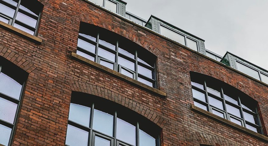
The design of the 42-room hotel was led by Timothy Griffin, principal at Wellbrook, who says: "The building is a historic 20th-century warehouse and we've placed a hotel template into that. The layout was determined around the window spaces and the light in the building. We drew lines on the floor to understand where walls would fit and how light would impact them. The building isn't listed, but we wanted to build on the beautiful fabric."
The two-storey loading dock of the former warehouse provides a striking lobby, with the original Victorian features exposed. Into this space has been placed a brass-topped bar with emerald green scalloped tiles, blackened steel ceiling-height units and statement lighting.
Griffin explains: "From a public space perspective, we wanted the lobby and lounge area to be very open and very visible from the street and essentially very welcoming to draw people in. We have these big double-height windows in the lobby and it's a very open, welcoming and light space."
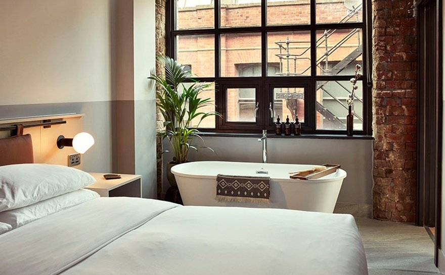
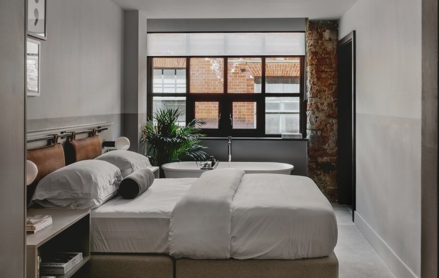
The 42 rooms comprise four accommodation types: Life Size (standard bedroom), Living Space (one bedroom suite), Living Large (one-bedroom duplex penthouse suite), and Living the Dream (two-bedroom duplex penthouse suite).
All have oak parquet or timber floors, bespoke furniture, Grown Alchemist bathroom amenities and 100% natural mattresses by Naturalmat. Griffin adds: "We uncovered and retained a lot of the original brickwork. Each of the rooms feels very different from the different parts that are exposed, which is super-charming."
The designer explains how the hotel's name informed an approach that aims to create a relaxed, homely environment: "Leven means life. We wanted to ensure the spaces encouraged people to use them in a way that suited their lives. We wanted to create spaces people felt immediately at ease in, so we've used a very calming palette, and for example in the lobby there's a lot of eclectic soft seating, textural fabrics and real stone. They are very elemental components that humans engage with naturally and that puts them at ease.
"There's also a lot of bric-a-brac in the bedrooms and the public spaces along with lots of books and all of the art is individually selected for the hotel. The furniture was also chosen piece by piece from markets or interesting traders and makers.
"All these components put people at ease and inspire them, because they look over the space and their eyes dance over the different layers. There's a lot to engage with."
Timothy Griffin's picks
The bar "I love a good tile and the bar is particularly striking. We've used an emerald green scallop tile and the way it juxtaposes with the brass top is, I think, very charming."
Window spaces "Behind the bar we have two original window alcoves and we've built a blackened steel shelving unit within each. These support the bar and serve as a merch area – I think that whole area is one of my favourite spaces."
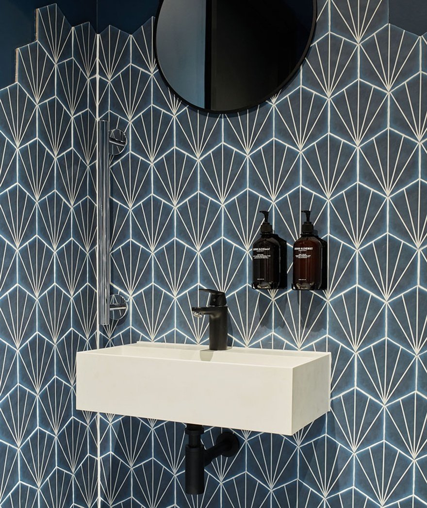
The bathroom "The lobby bathroom tiles are these beautiful hexagonal deep blue tiles that go across the floor and then partially cover the wall. The rest of the wall is painted in Farrow & Ball Stiffkey Blue. It's a very striking room."
Continue reading
You need to be a premium member to view this. Subscribe from just 99p per week.
Already subscribed? Log In


